Multiple Chart Types
Scatter, Bar, Line, Pie, Radar, and more visualization options
Multi-Column Support
Compare multiple data series with advanced column selection
Instant Results
Upload Excel files and generate beautiful charts in seconds
Predefined Chart Themes
Use pastel, neon, and other themes for stylish charts
Export Options
Download charts as PNG or export data to Excel/PPT
Per-Chart Filters
Apply custom filters on each chart independently
Chart Gallery
Explore the variety of professional charts you can create with our Excel Visualizer. Each chart type offers unique insights and customization options.
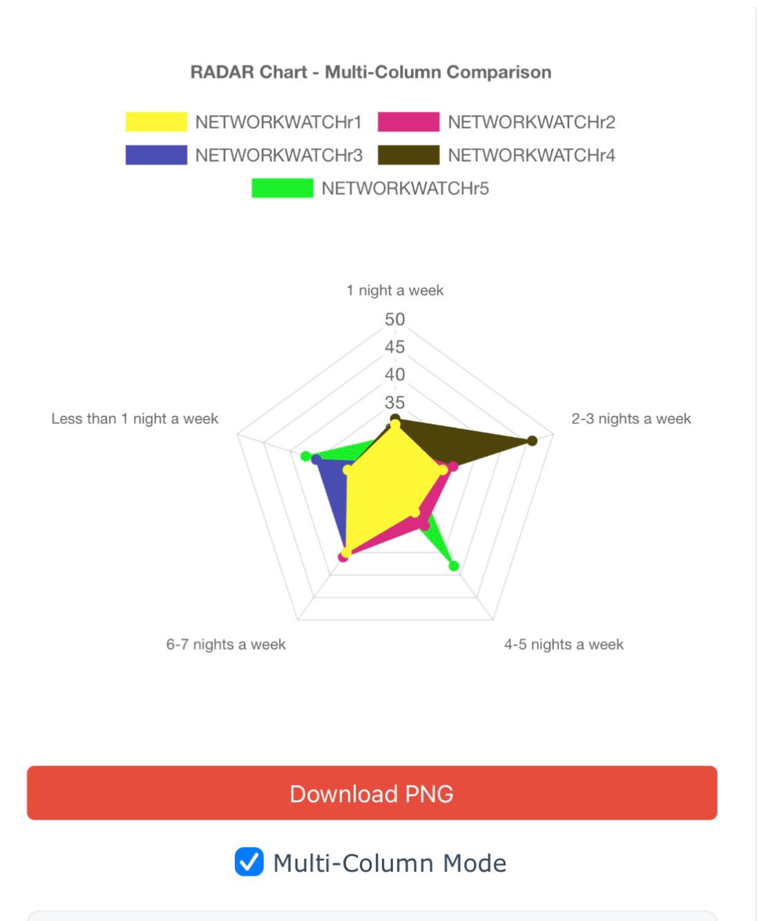
Radar Chart Comparison
- Multi-series overlay
- 360° comparison
- Dynamic scaling
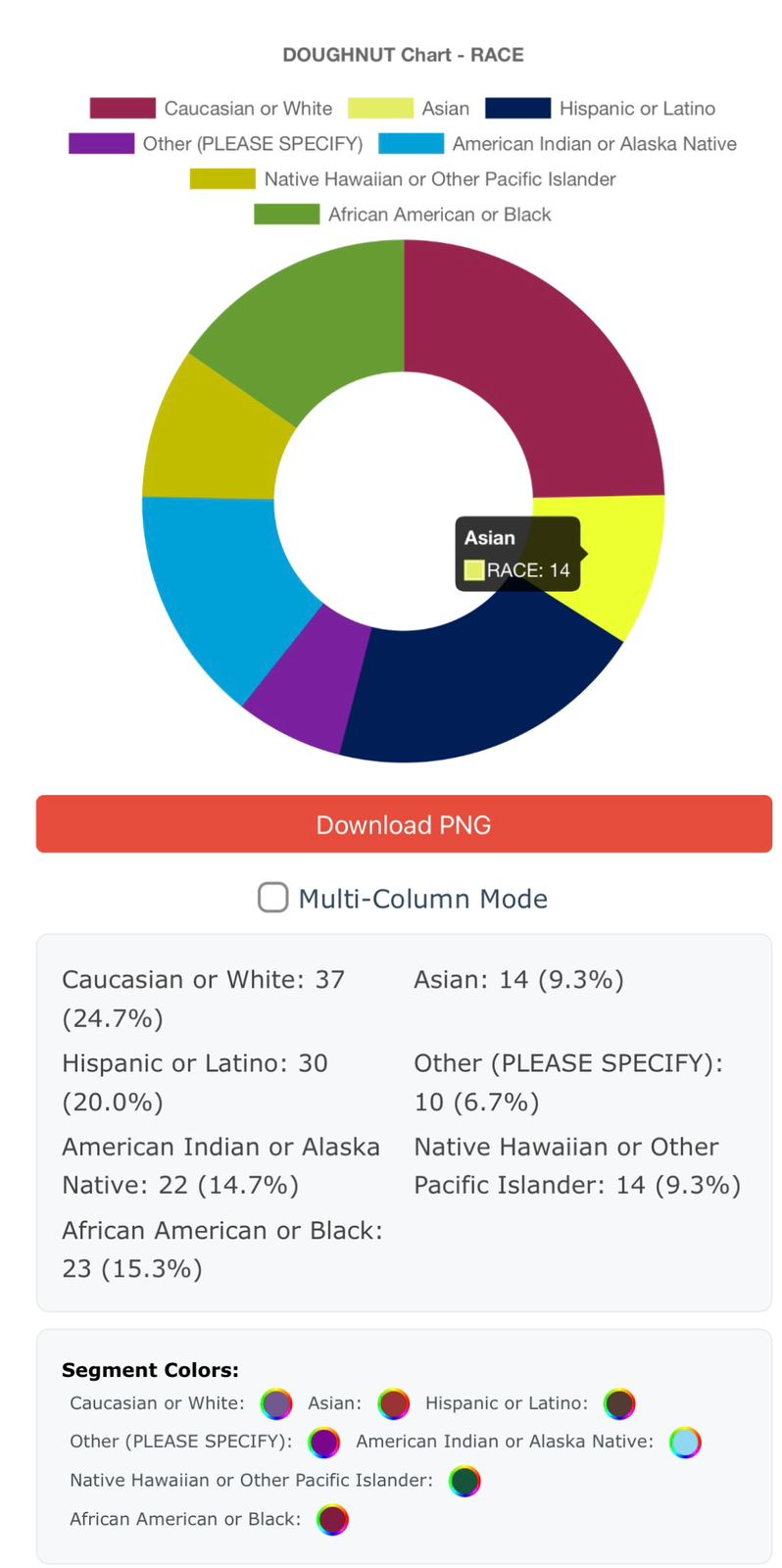
Doughnut Chart Demographics
- Segment highlighting
- Custom colors
- Percentage display
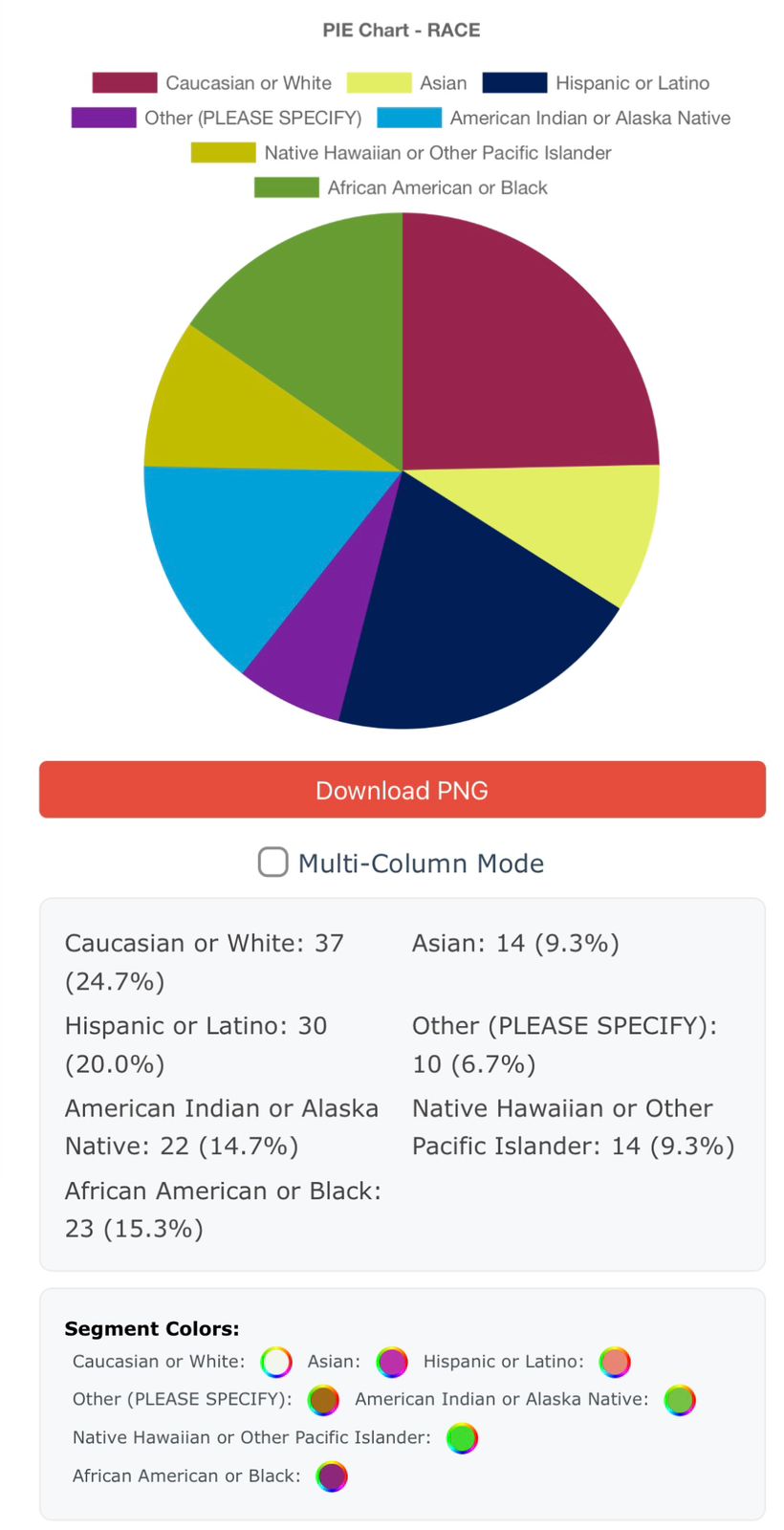
Pie Chart Visualization
- Color-coded segments
- Data labels
- Export options
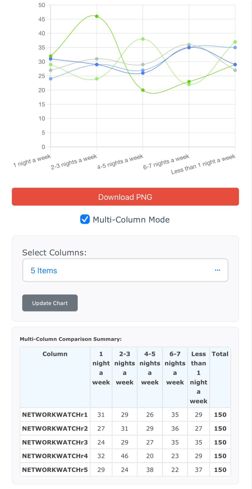
Line Chart Trends
- Trend analysis
- Multi-line plotting
- Smooth curves
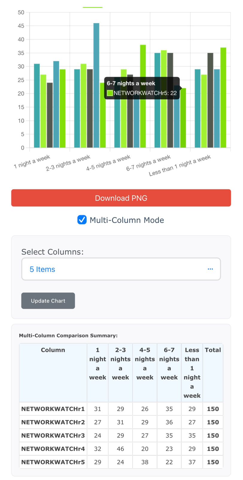
Bar Chart Comparisons
- Grouped bars
- Statistical summary
- Category comparison
Ready to create your own professional charts?
📊 Transform Spreadsheets into Interactive Visuals
Tired of staring at raw rows and columns? The Excel Data Visualizer Tool helps you turn complex spreadsheet data into beautiful, interactive charts with just a few clicks.
Whether you're analyzing survey results, sales data, research findings, or feedback reports — this tool makes your data clearer, smarter, and ready to share.
✨ Key Features
- ✅ Upload Excel Files Instantly: Import .xlsx files and instantly access your data for chart generation.
- ✅ Multiple Chart Types: Visualize data using bar, line, pie, doughnut, radar, bubble, scatter, and even 3D charts (bar & horizontal).
- ✅ Multi-Column Comparison: Select multiple columns to compare trends across different dimensions in a single view.
- ✅ Per-Chart Filters: Apply customized filters for each chart separately to fine-tune insights and focus on what matters.
- ✅ Themes & Color Control: Choose from preset themes (Pastel, Neon, Dark, etc.) and define custom colors for segments or series.
- ✅ Download & Export: Export your charts as PNG or generate comprehensive PowerPoint reports with one click.
- ✅ Save & Reuse Settings: Save your chart configurations for each project and reload them any time.
🚀 Who Is It For?
- Educators analyzing survey responses
- Researchers exploring patterns in datasets
- Marketers visualizing campaign performance
- Startups presenting product feedback
- Anyone who wants clean, smart, visual data stories!
💡 Why Choose This Tool?
Unlike static Excel charts, this tool offers interactivity, customizability, and presentation-ready outputs — all in a modern web interface. No technical knowledge required!
🧪 Try It Now – Free
Upload your first Excel file and see your data like never before.