📂 Getting Started
Welcome to the Excel Data Visualizer — your all-in-one solution to convert Excel spreadsheet data into interactive, visual insights.
This guide walks you through how to use the tool, features included, and how it helps you present your data clearly and visually.
🚀 Step-by-Step Instructions
- Upload Excel File: Click the
Choose Filebutton and select your .xlsx file. - Select Columns: Choose one or more columns from your Excel file to visualize.
- Choose Chart Type: Pick your preferred chart style (Bar, Pie, Line, Doughnut, etc.) for each column.
- Apply Filters: Select filter values globally or per individual chart to refine the data shown.
- Customize: Change theme colors, toggle multi-column mode, and choose custom segment colors.
- Download or Export: Save your charts as PNG or export everything into a professional PowerPoint.
🧠 Features Explained
- Multi-Column Charts: Combine and compare multiple data columns in one visual.
- Per-Chart Filters: Filter individual charts independently from global filters.
- Color Control: Define custom segment colors or apply theme-based palettes.
- 3D Charts: New 3D Bar & Horizontal Bar Charts for better visual distinction.
- Auto Save: Automatically saves chart configurations per project or Excel file.
📈 How This Helps You
Raw data in spreadsheets is hard to interpret. Visual charts make trends, outliers, and comparisons easy to understand.
- 📊 Better Insights: Spot key patterns and data clusters in seconds.
- 🎯 Presentation Ready: Download visuals for meetings, presentations, or reports.
- 🧪 Experiment Freely: Try different views without modifying the original file.
- ⚙️ Reusable Settings: Save time by loading chart settings for repeat projects.
Chart Gallery
Explore the variety of professional charts you can create with our Excel Visualizer. Each chart type offers unique insights and customization options.
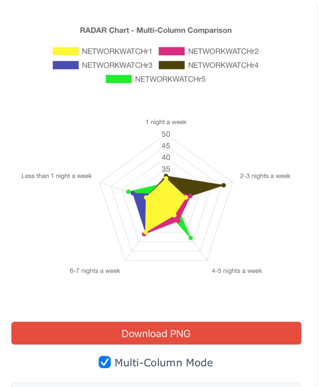
Radar Chart Comparison
- Multi-series overlay
- 360° comparison
- Dynamic scaling
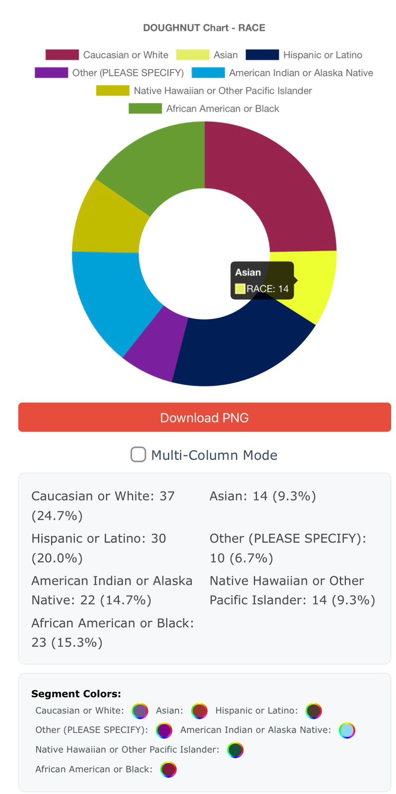
Doughnut Chart Demographics
- Segment highlighting
- Custom colors
- Percentage display
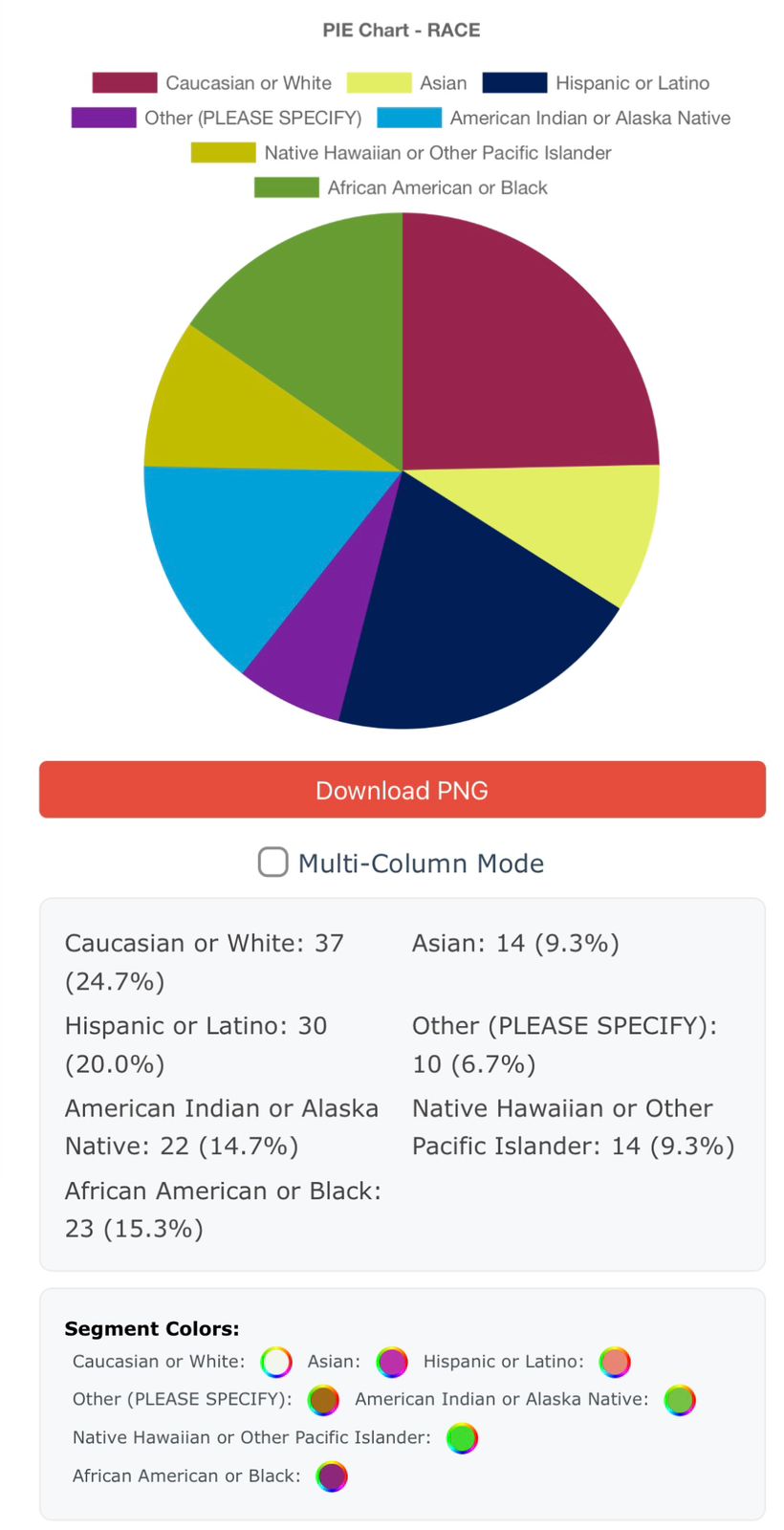
Pie Chart Visualization
- Color-coded segments
- Data labels
- Export options
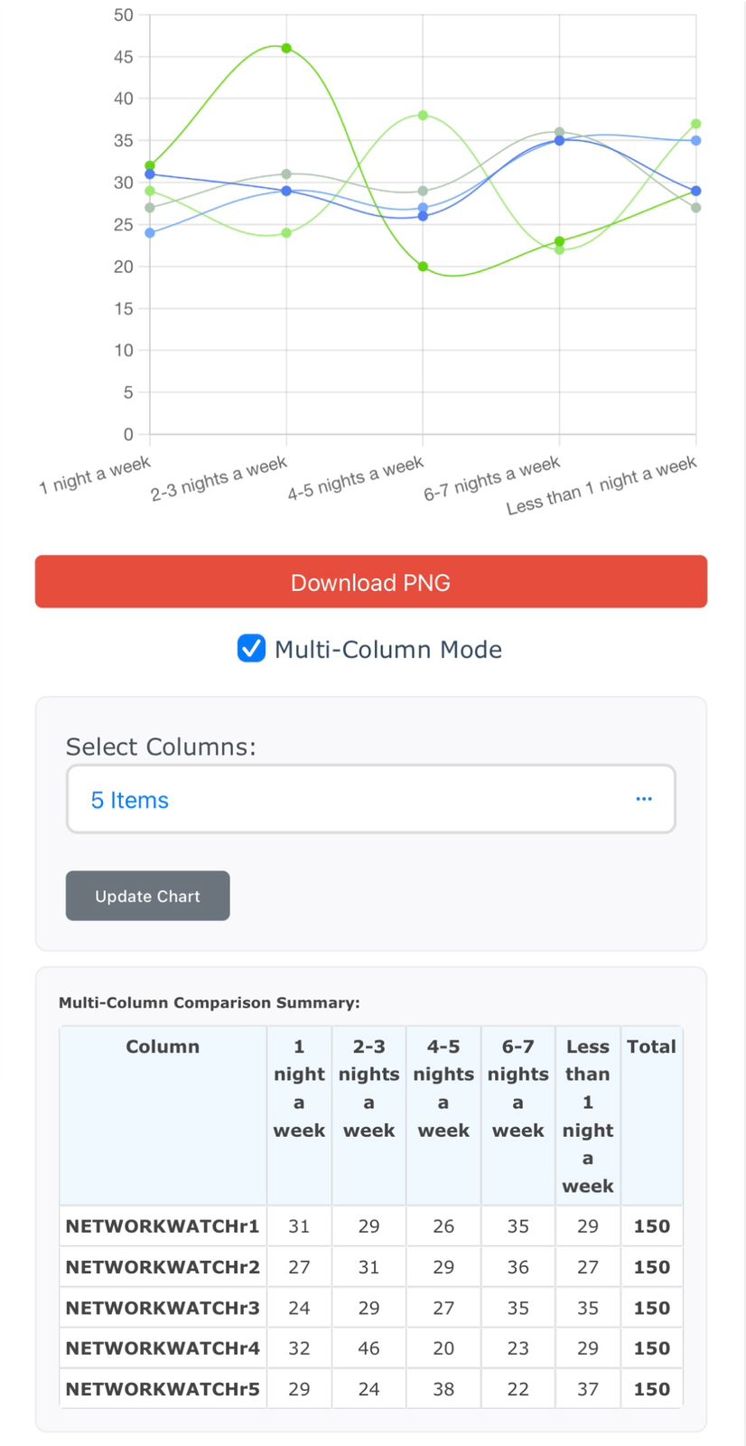
Line Chart Trends
- Trend analysis
- Multi-line plotting
- Smooth curves
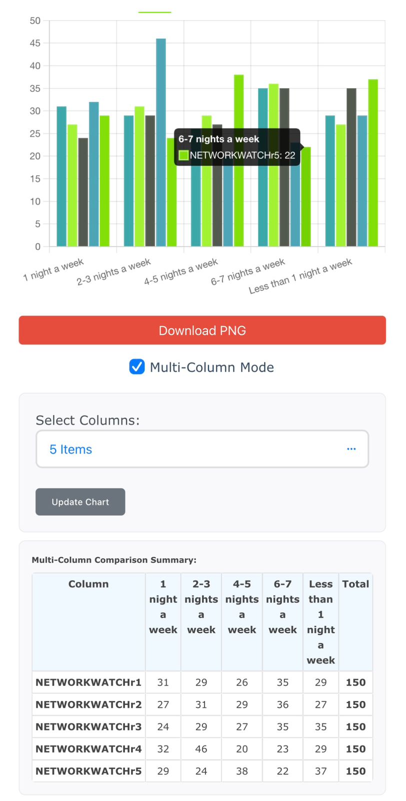
Bar Chart Comparisons
- Grouped bars
- Statistical summary
- Category comparison
📥 Exporting Options
- PNG Download: Every chart includes a button to save it as an image.
- PowerPoint Export: Export all charts and summaries into a PPTX file — including per-chart filters and color legends.
💡 Tips for Best Use
- Use consistent data formats in Excel for accurate results.
- Shorten column names for cleaner chart IDs.
- Try different themes for improved visibility based on audience.
- Use the per-chart filter to isolate demographics, dates, categories, etc.
📚 Need Help?
If you run into issues or have suggestions, please contact our support team or visit the FAQ section on the homepage.